
The second Round Robin experiment is coming along very well (and almost completed). So far, about fifteen labs have returned data, to a total of 35 datasets (some labs had multiple instruments available). Unlike last time, this time the sample has proven to be stable. So what do the resulting curves look like?Well, there is a catch. The experiment is still going on, so I cannot publish the curves just yet. What I can do, however, is show how much the labs are deviating.
From the fifteen labs, we excluded one whose data was very far off the mark due to instrumental errors. From the remaining, a “representative” dataset was chosen, under the conditions that the data had to have small uncertainties, little visible noise, and positioned somewhere in the middle of the remaining datasets. Naturally, the choice for a representative dataset can be improved, but for today, it doesn’t matter.
The curves were scaled so that the $\chi^2_r$ was minimized with respect to the representative. In order to do that, I fitted the scaling as well as a flat background contribution (which are easy to have in datasets for a wide variety of reasons). I’m not sure I’ll keep the background addition for the publications, arguments can be made for or against their inclusion (and should be placed in the comment section).
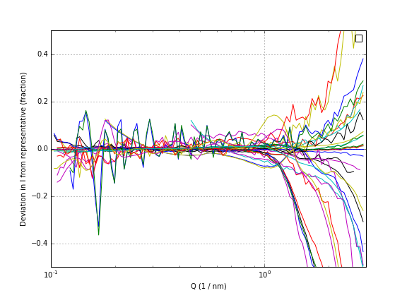
The deviation of the intensity compared to the representative is shown in Figure 1. It is obvious that there are a few noisy datasets, and that the deviation in intensity increases dramatically towards the higher Q values. There, deviations of up to 80% can be observed. However, the plot is a bit difficult to interpret, and needs more detailed analysis.
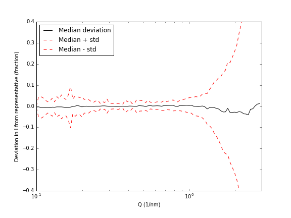
To do that, I calculated for each Q-value the median value, and the standard deviation. Now, please note that I am not a statistician, so I hope I’m not making a fool of myself here (if I do… comment section, please!). The median sticks fairly well to the zero value, which means that the representative dataset is quite well chosen. The standard deviation shows what we have concluded before: the deviation explodes at higher Q values. We also see, however, an increased uncertainty in the low-Q region (due to, I suspect, the poor corrections around the beamstop). Apropos, this also demonstrates nicely the need for more consistent data corrections, with which we may hope to reduce the deviation between datasets.
The next task is to fit all the data, and to see what effect these deviations have on the final size distribution values. Once we have some grasp on that, I will be letting you know! I’m very curious to hear what your opinions are so far on the experiment.
Leave a Reply